
Recently I was invited to give a workshop at the 2020 Summer School event of the Visual and Automated Disease Analytic (VADA) graduate training program. My workshop focused on visualizing COVID-19 data in multiple countries, demonstrating how to 1) build interactive visualizations using plotly::ggplotly(), 2) compute relative timelines for each country and 3) plot sequence of key events for cross-country comparison. To structure the workshop and create the criteria of success/progress, I have broken down the session into three parts, each aimed at producing a graphic.
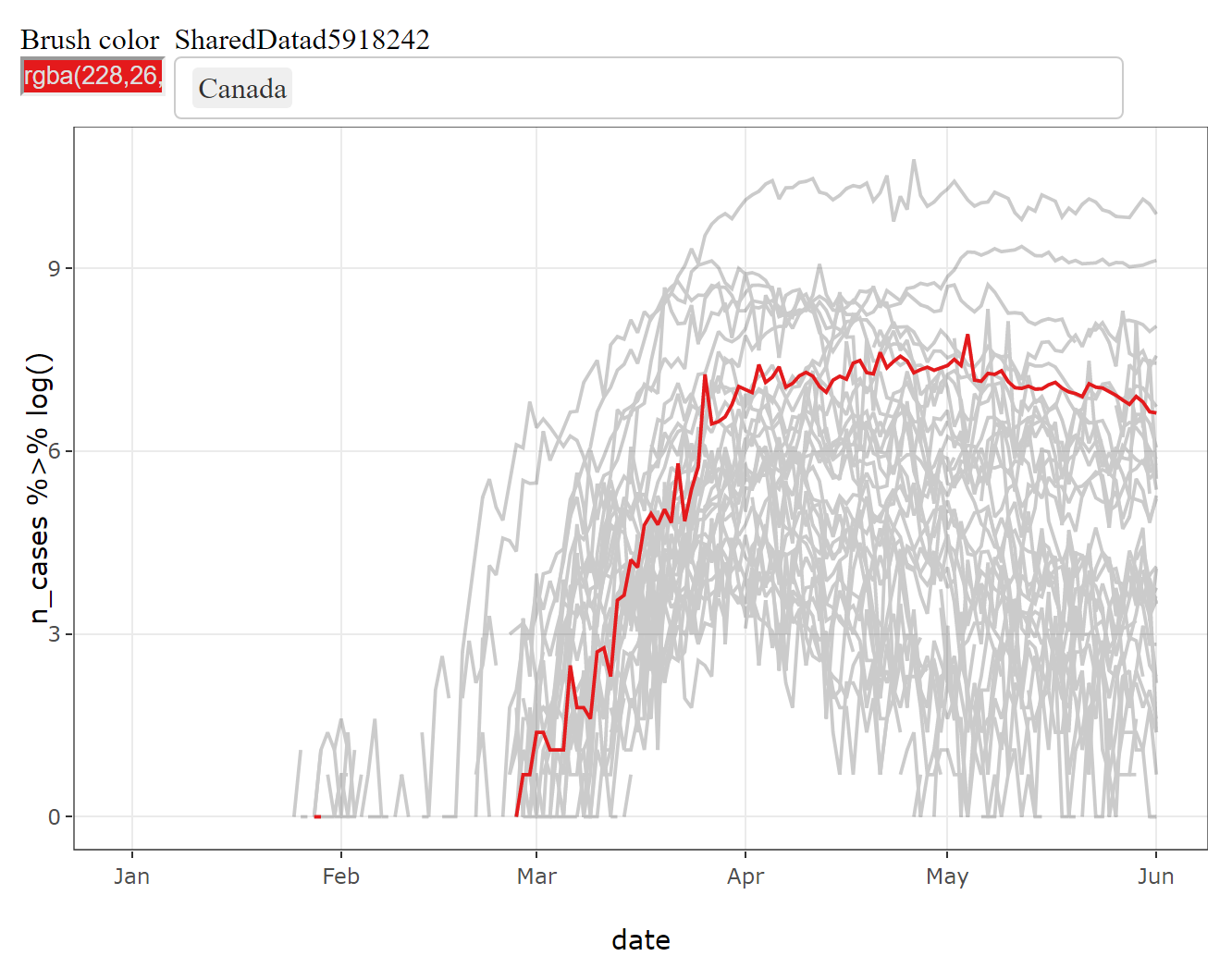
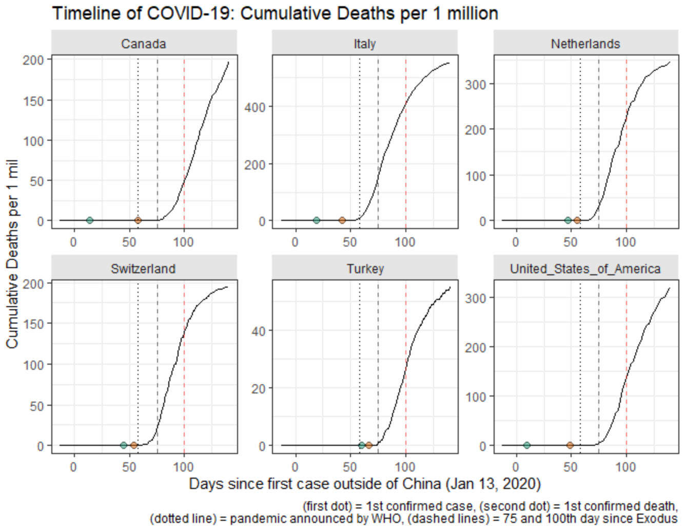
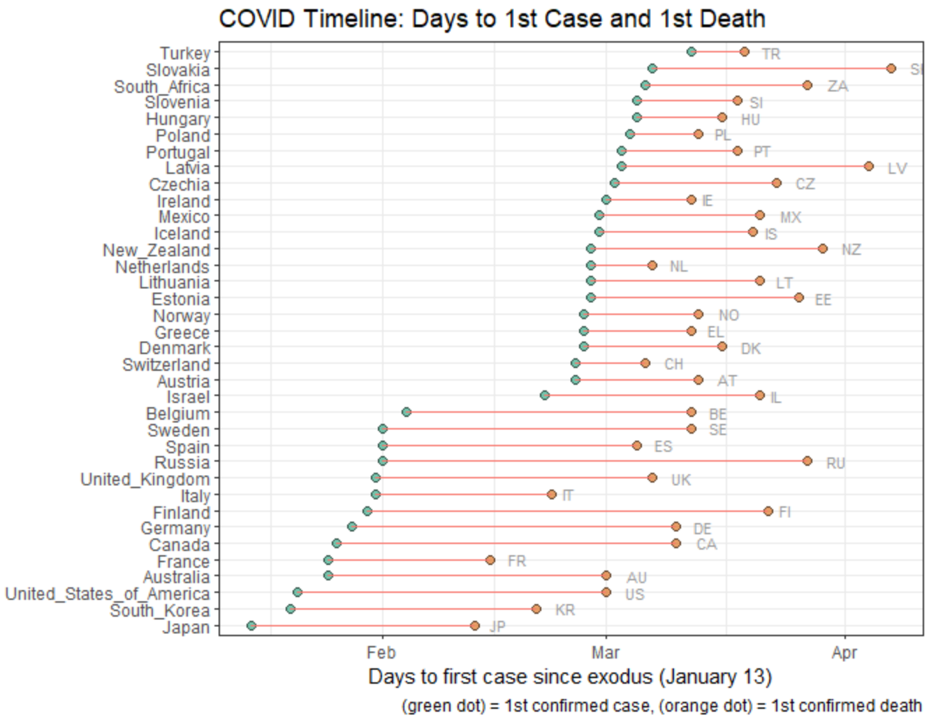
| Goal 1 | Goal 2 | Goal 3 |
|---|---|---|
| Timeseries with interactive highlights | Trajectories with relative timelines | Sequence of key epidemiological events |
 |
 |
 |